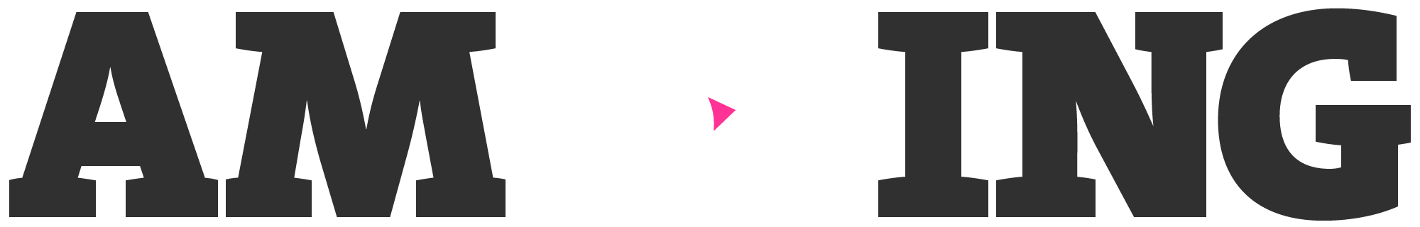
(cue booming voice over)
From animated logos to full Disneyesque extravaganzas, making things move beautifully on screen can move people and – in the best RB fashion – get them moving.
The End.
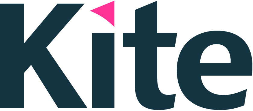
In 2009 we rebranded RB. We defined the corporate brand as The Power behind the Powerbrands and introduced the promise unleashing performance.
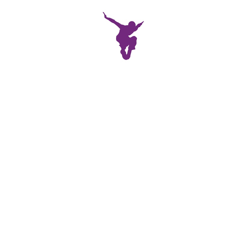
This positioning inspired our striking visual metaphor for RB’s identity – a high performance sports kite (The Fury) – symbolising RB brands and the unique attributes of power, speed and agility.
We built the strategically important shorthand – RB – into the kitemark, in preparation for a future name change. Lift off!
1998
Original logo
2009
New logo
2013
Strategy change
2014
Name change
2014
Name change
2013
Strategy change
2009
New logo
1998
Original logo
Splat Attack! The games app we created gives visibility and recognition to the RB corporate brand by linking with some famous brands you might recognise.
With nearly 300,000 plays after only a few months the app put RB on top of the leaderboard for graduates.
Cut the Mustard
French’s Mustard
Splat Attack
Vanish
Face Invaders
Clearasil
Hit the Spot
Durex
Kitchen Chaos
Dettol
Smooth Operator
Veet
Digital is at the heart of practically everything we do of course. But some projects are more pixelated than others. In 2009 we designed and built rb.com and last year quickly rustled up rb.com mobile site in 6 weeks! See it here.
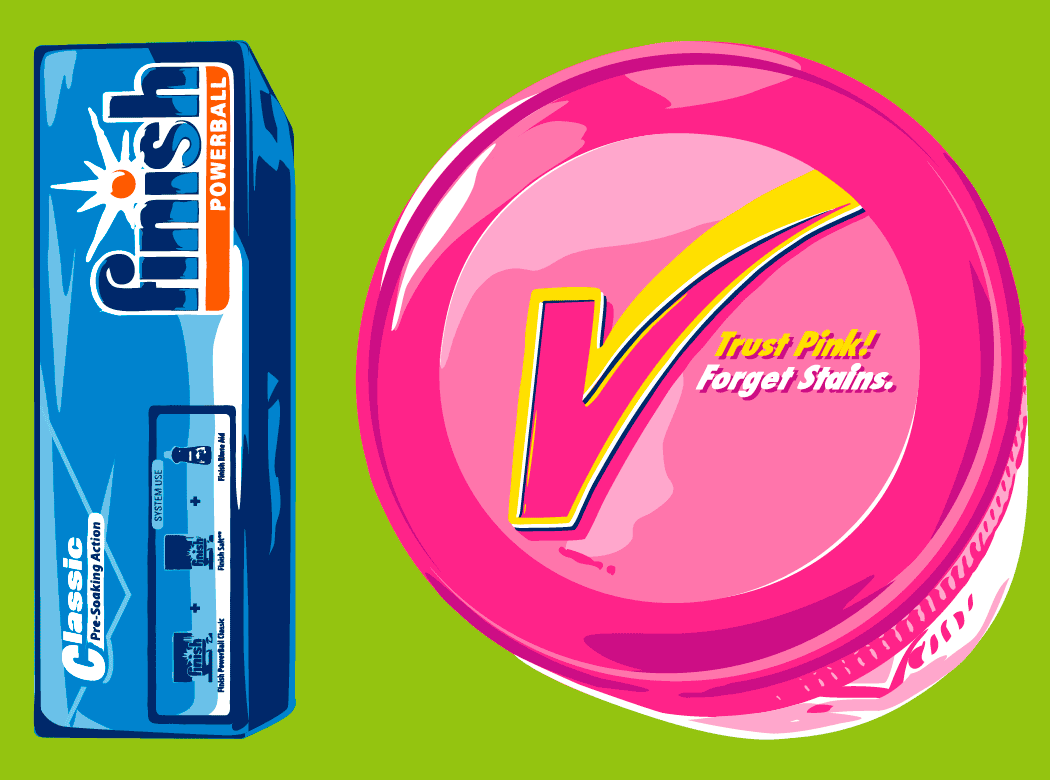
We also designed the first brand site on the Buzz – for Vanish…
Stimulate your career! Powerbrands with which students have most affinity were used to attract them to heart-thumping career opportunities at RB. The year-long awareness campaign in 9 global territories from Australia to Brazil kicked off with an immersive campus experience at a top UK University featuring Nurofen, Clearasil and Veet.
And of course, if the chemistry proved particularly strong, the Durex was boxed and ready for action.
For us, a distinctive and ownable brand is one that bothers to cross the t’s and dot the i’s. Drawing inspiration from the RB kitemark, we designed, crafted and then digitised RB’s unique Kite Display fonts.
It’s the kind of attention to detail you should expect from us – and a global brand.
Kite Display Bold
abcdefghijklmnopqrstuvwxyz
ABCDEFGHIJKLMNOPQRSTUVWXYZ
0123456789(!@£$%&*-–—.,;:“”‘’/\?•)
Kite Display Light
abcdefghijklmnopqrstuvwxyz
ABCDEFGHIJKLMNOPQRSTUVWXYZ
0123456789(!@£$%&*-–—.,;:“”‘’/\?•)
The Game Changer employer brand platform was the ideal opportunity to create a stand out recruitment campaign which genuinely reflects the spirit and energy of the business. RB people are the heroes (obviously!) as their stories are used to inspire others.
Smart move, Silvie.
When RB’s strategic purpose was defined as Healthier Lives & Happier Homes, we were on hand to help craft appropriate symbols, design the deskdrop that revealed the positioning and new geographies, and create the marcomms to launch it internally. And we made sure the outside world understood the shift by building the new descriptor into RB’s logo too…

How to communicate with your people is a constant challenge for a dynamic, growing business such as RB, with 38,000 employees in 60 countries.
You need comms that help rather than hinder your daily routine. We’ve helped RB create internal communications that inform, influence, and inspire.
 (Konnichiwa)
RB’s global language is English but doing business and attracting the right people often means using the local language. We created simple templates so country websites can be built quickly. Japan, China, Germany, Italy, Brazil, Poland, and India are just some that now have their own sites.
Ciao!
Further, faster, higher! A high performance sports kite called ‘The Fury’ is the symbol for the spirit of the business. Just like RB – and its people – the kite is agile and fast. We’ve been playing with kites for many years and are still finding new and amazing things to do with them.
Hold on tight!
The clever one, the fun one, the sporty one, the dynamic one.
Whether it’s for a conference, programme, or charity event, RB logos need to have their own personality, but must be part of the wider RB brand family. All equal, but different.
If you need an identity, and you need it sharpish, call the Workroom logoline.
Corporate brand
Corporate strategy icons
Corporate and operational branding
Sustainability programme branding
Conference branding
Corp Comms set us the challenge to design and build the rb.com mobile site in six weeks. We audited all rb.com content, rewrote copy, and designed a site with bespoke content that puts the power of RB in your hand, quickly.
Finished by the deadline, time to go Home.
It certainly is a numbers game, isn’t it? And infographics are perfect to breathe life into dry subjects. They’re gorgeous. And as every area of RB is so productive, goal-oriented, and dedicated to delivering stonking results, what could be better than using this technique to capture the scale, diversity, and sheer volume of what they achieve?
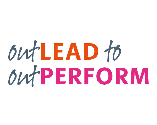
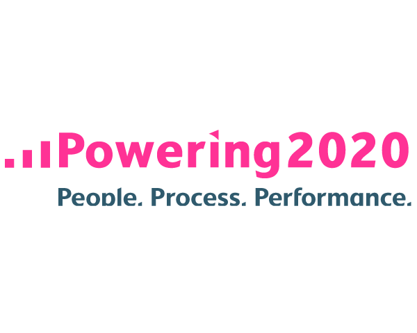
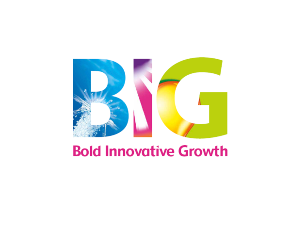
It’s amazing how many different creative ways we’ve found to represent various aspects of the intangible ‘outperform’ word. Almost every year since 2007 we’ve helped to theme and brand key global conferences (Top40, Top400, IS, HR, Category, R&D & UK Business).
Death by PowerPoint? It doesn’t have to be. There are simple ways of creating stand out and we’ve worked hard to master them for students and investors alike. Telling a good story, adding a dash of visual personality and animation will keep people in the room.
Creative agencies are always keen to do quirky, fun, and cheeky things. As well as designing ‘rubbish’ awards (see it here), kite silk and neoprene laptop bags, and singing cards, we’ve also been known to create naughty-but-nice branded cupcakes for parties! (Our 10th anniversary working with RB).
We’ve told the RB strategy story in a fresh way for the past 14 years (it may even be a world record). From photography of in-store Vanish demos in Turkey to a Bang! comic book style, we’ve designed and produced the annual and sustainability reports in every imaginable way, in print and online.
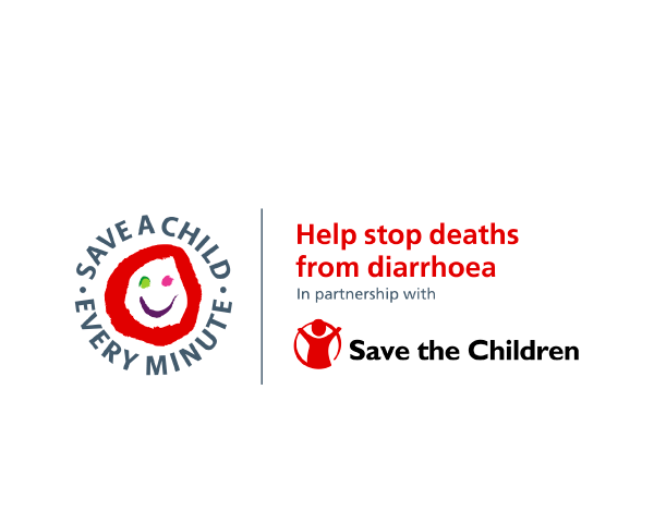
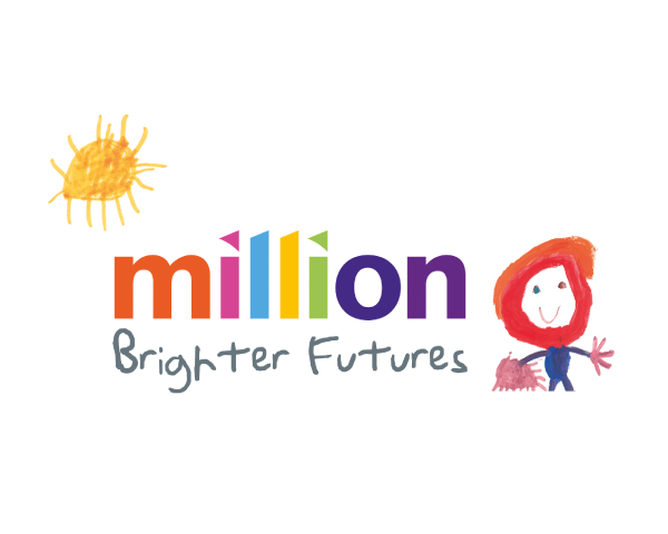
RB’s sustainability strategy has been growing in strength, depth, and reputation every year. From creating RB’s Million Brighter Futures identity and website to Save a Child Every Minute campaign on-pack, we’ve brought creativity, impact, and longevity to the message.
Topical. Tenacious. Tightly-managed.
In fact, every sort of RB conference we’ve branded (Top40, Top400, IS, HR, Category, R&D, UK Business, etc) has needed a stand out identity and brand design that brings alive the theme and inspires those attending. All helping to put RB on Top.
Go for the thrill! To engage talented graduates and early careerists, we created a fast ’n furious online free-running game.
Urban Thrill takes you from downtown New York to the domed Taj Mahal of India and beyond, perfectly capturing the excitement of a career with RB. The number of plays leapt to 1.6 million in the first year.
Germany
Russia
Australia
USA
London
Brazil
France
Italy
Where would a business be without its vision for the future and its values to guide its growth? We helped articulate the values and developed a poster campaign using high performance sports imagery to represent the true RB spirit!
How do you squeeze water out of the business to reduce global water impact by a third by 2020?
We started by creating a big splash with a lift takeover, grabbing attention for a water-reducing idea competition. The elevator pitch really paid off. Great ideas poured in.
A lion tamer that Vanished, the Great Gats’RB, and even a Durex reindeer have all featured in RB’s celebrations of the festive season. As Christmas has been around for 2000 years (give or take), the challenge to do something different every year simply pushes the Workroom team to be even more creative.
As for the ‘Cirque du RB’ party, featuring the lion – it was a roaring success.
We love winning awards (especially when we win with our clients).
Not all ideas can be winners, though. To stir up some competition between RB’s creative agencies, we reinvented the wooden spoon and designed an award for the most rubbish ad of the year. The first person to get his hands on the trophy was our model maker who hand-crushed the aluminium sheeting by using chain mail gloves.
Are you a Hero or a Villain?
To compel people to reduce the environmental impact they make at work with waste, we didn’t get all preachy. We put some character into it and transformed the project into a fun quiz that brought out that RB competitive edge in everyone.
Upping the uptake, revitalising revenues, concluding conversions, or energising engagement.
We love the impact our work makes as much as we love making it. And our strategic creativity gains commercial results for a host of other clients, as well as for RB. After all, variety is the spice of life.
We build brands and experiences.
We’re a team of brand strategists, designers, UX consultants, copywriters, film-makers, project managers and planners. We also have a network of partners – all industry leading figures built up over 20+ years in the business – who do everything from audience insight and data analysis, to media buying and digital product development.
Click right to meet the team.
+44 (0)20 7608 0840
Isn’t it

How much you can achieve when agencies and clients work together.