The global challenger in beauty
On 3 October 2016, beauty company Coty launched on the NYSE. It was the result of one of the largest recent mergers in that industry, between Coty and Procter & Gamble’s Beauty Business. Overnight, they became the third biggest beauty company in the world, with over $9 billion in revenue and 20,000 employees.
Only 9 months before this, Coty had asked us to partner with them to define what the ‘new’ Coty brand would stand for and to help distil their vision to be a challenger in beauty.
Scroll down for full story.
STOP PRESS: Coty rebrand awarded Best of Show winner in the 2018 REBRAND100 Global Awards.
See also our article on the 5 things we’ve learned from one of our biggest rebrands.
Impact & Results
- Cultural alignment of two diverse businesses
- 106+ country rollout
- 20,000+ employees engaged
- Winner GDUSA American Graphic Design Awards – Brand identity
- Best in show REBRAND 100 Global Awards
A symbol of beauty and diversity
Research into the beauty marketplace revealed an industry that’s predictable in its presentation and complacent in its representation of the individual. This was the catalyst for Coty’s brand strategy to be about a more diverse and unexpected perspective on beauty.
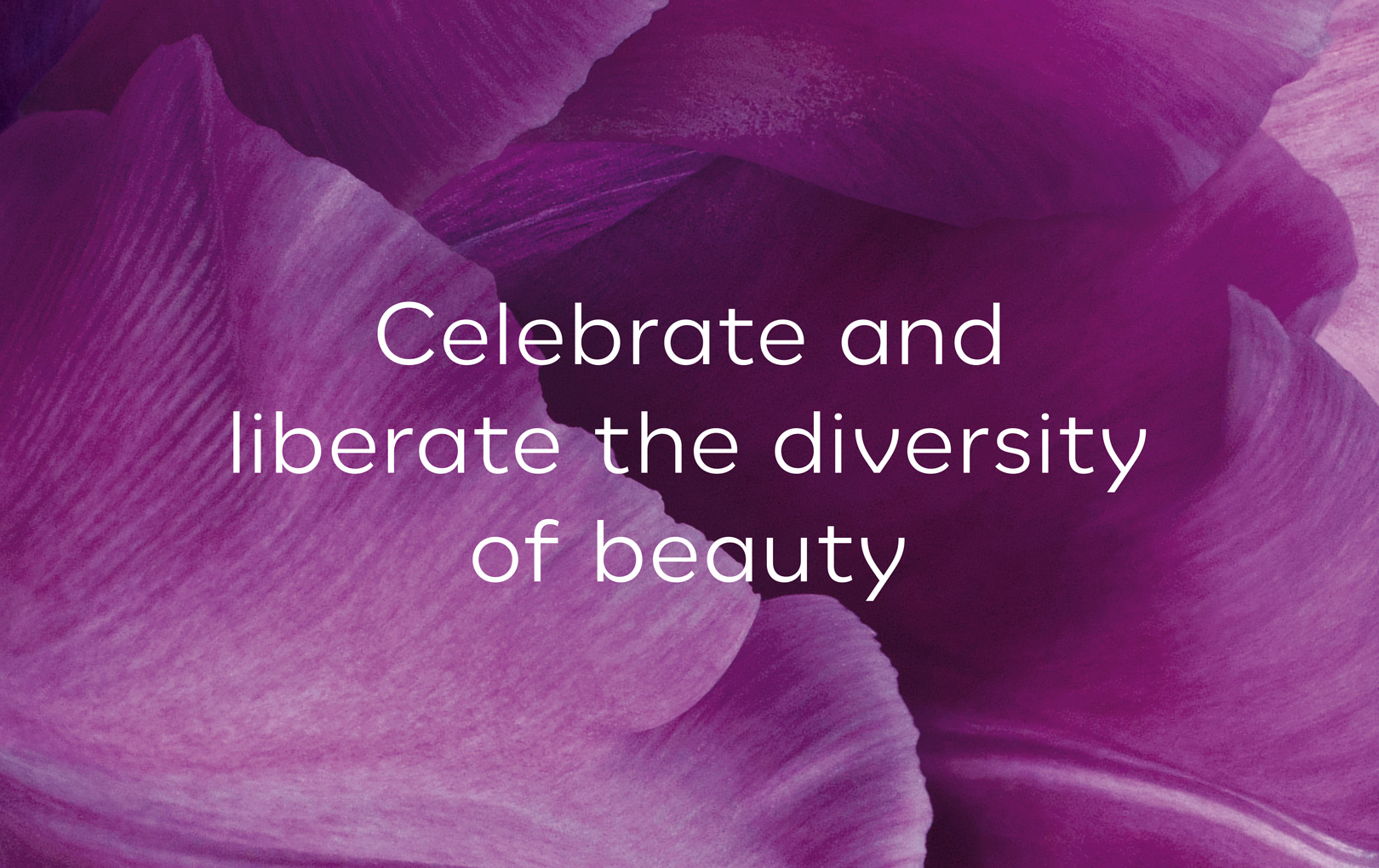
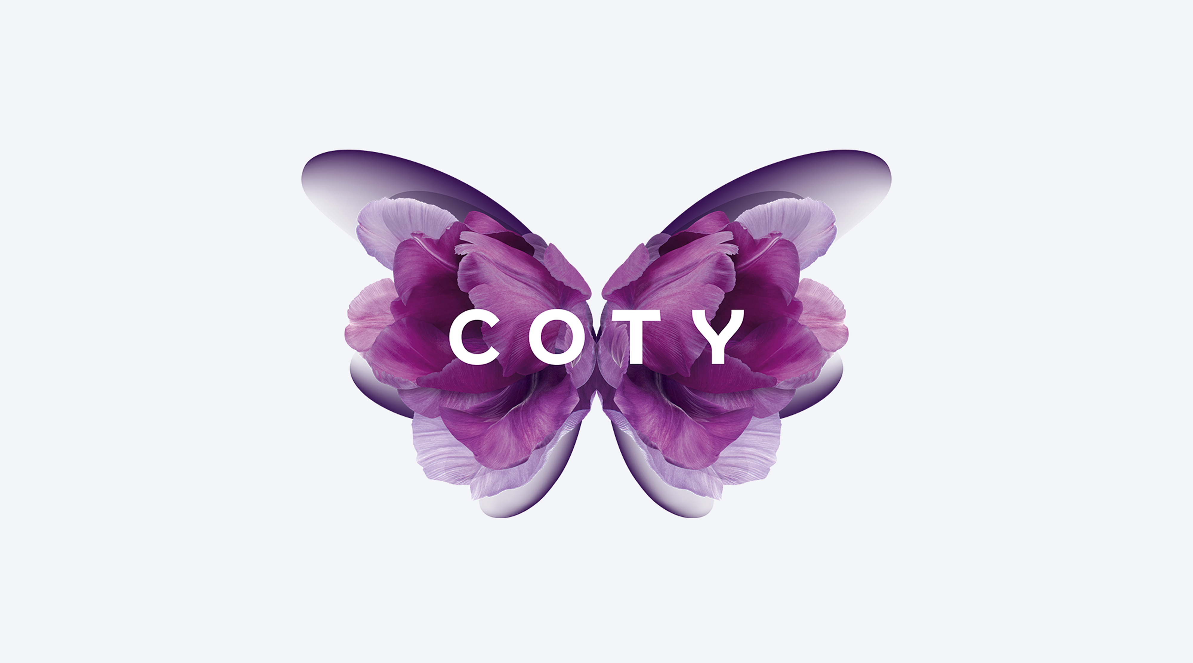
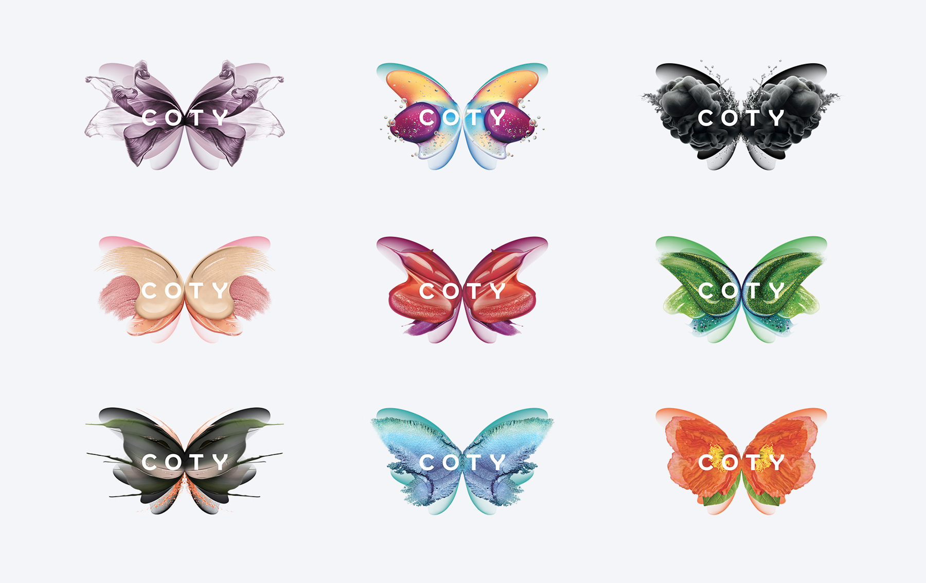
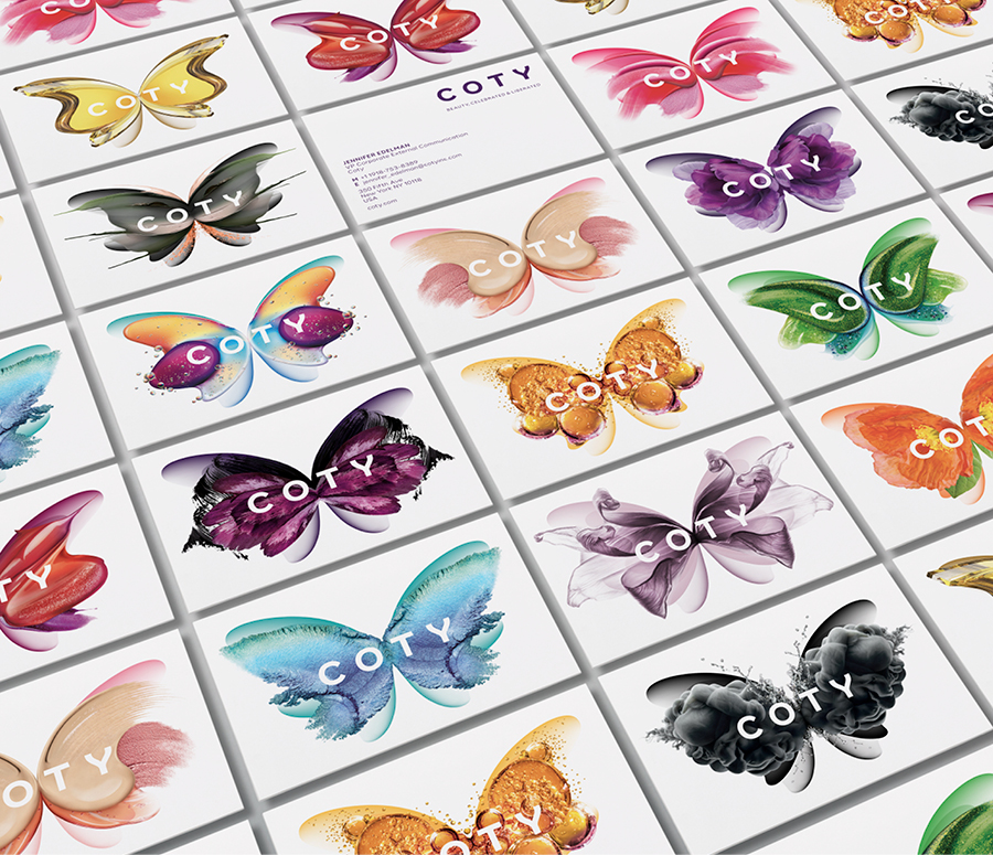
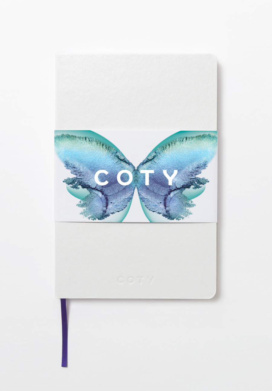
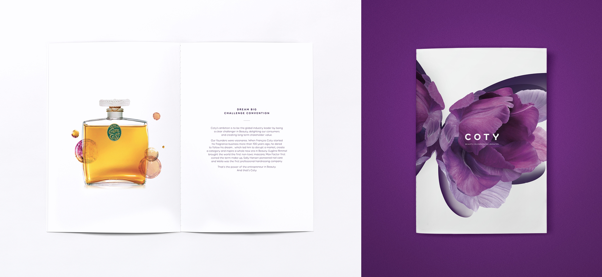
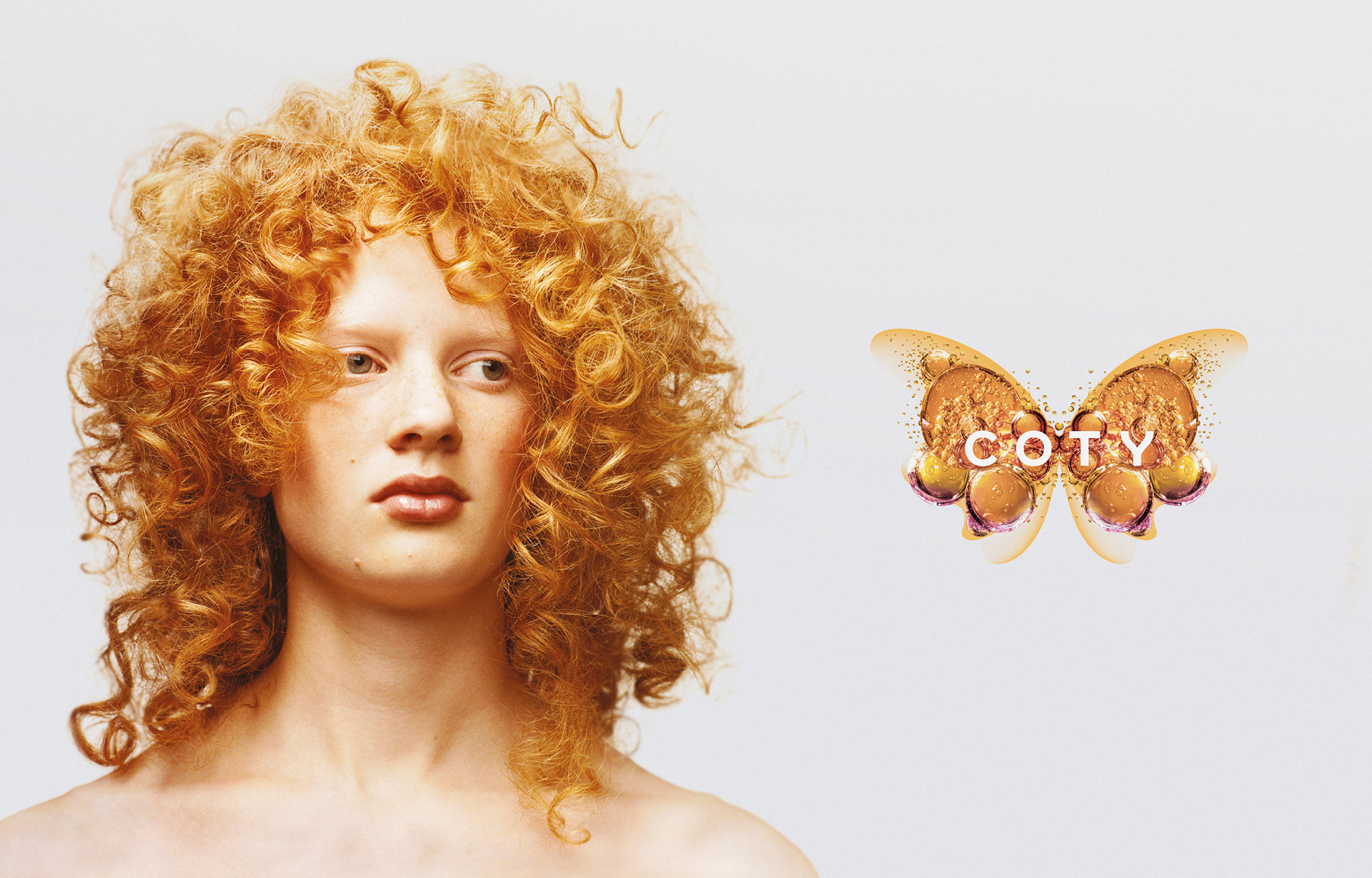
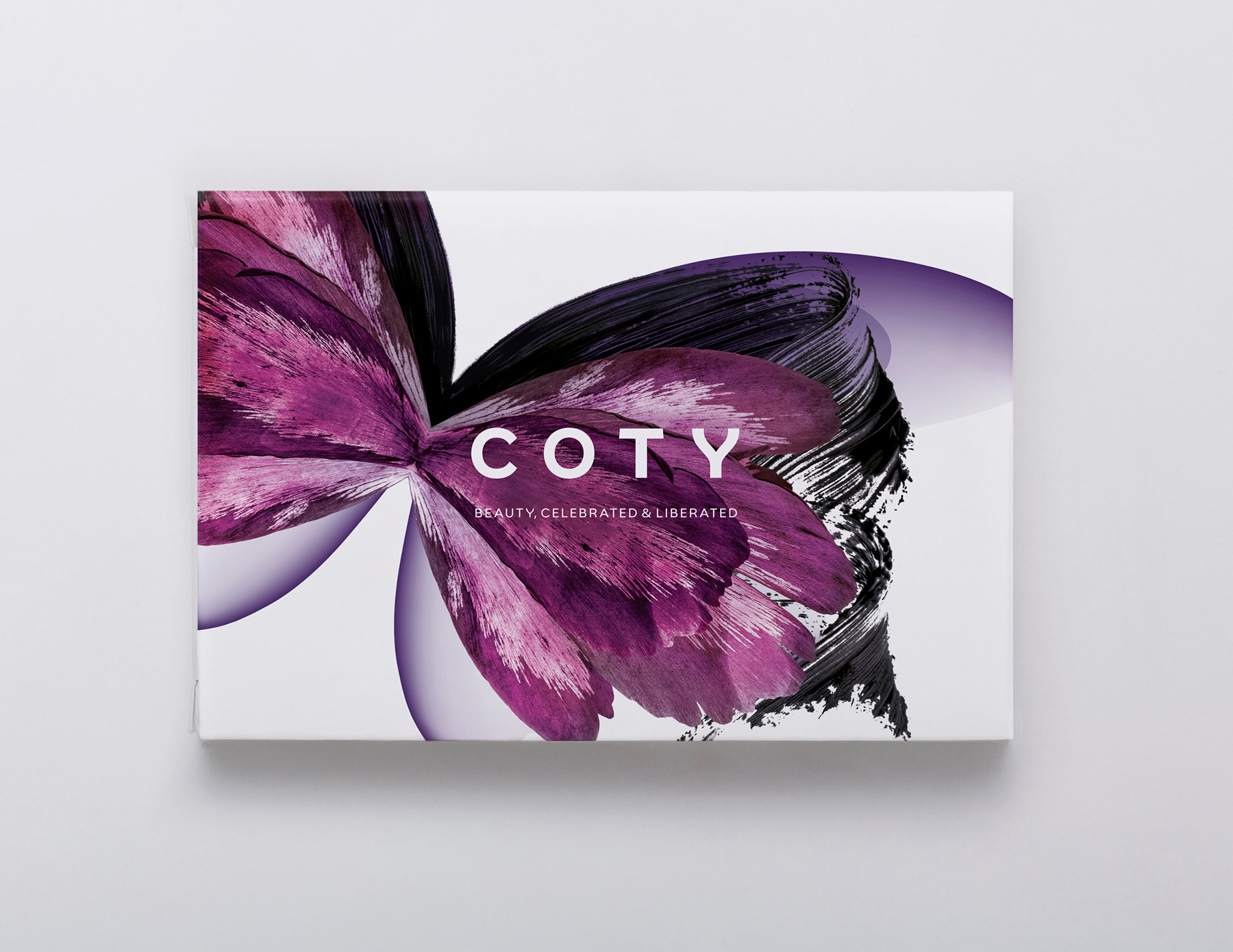
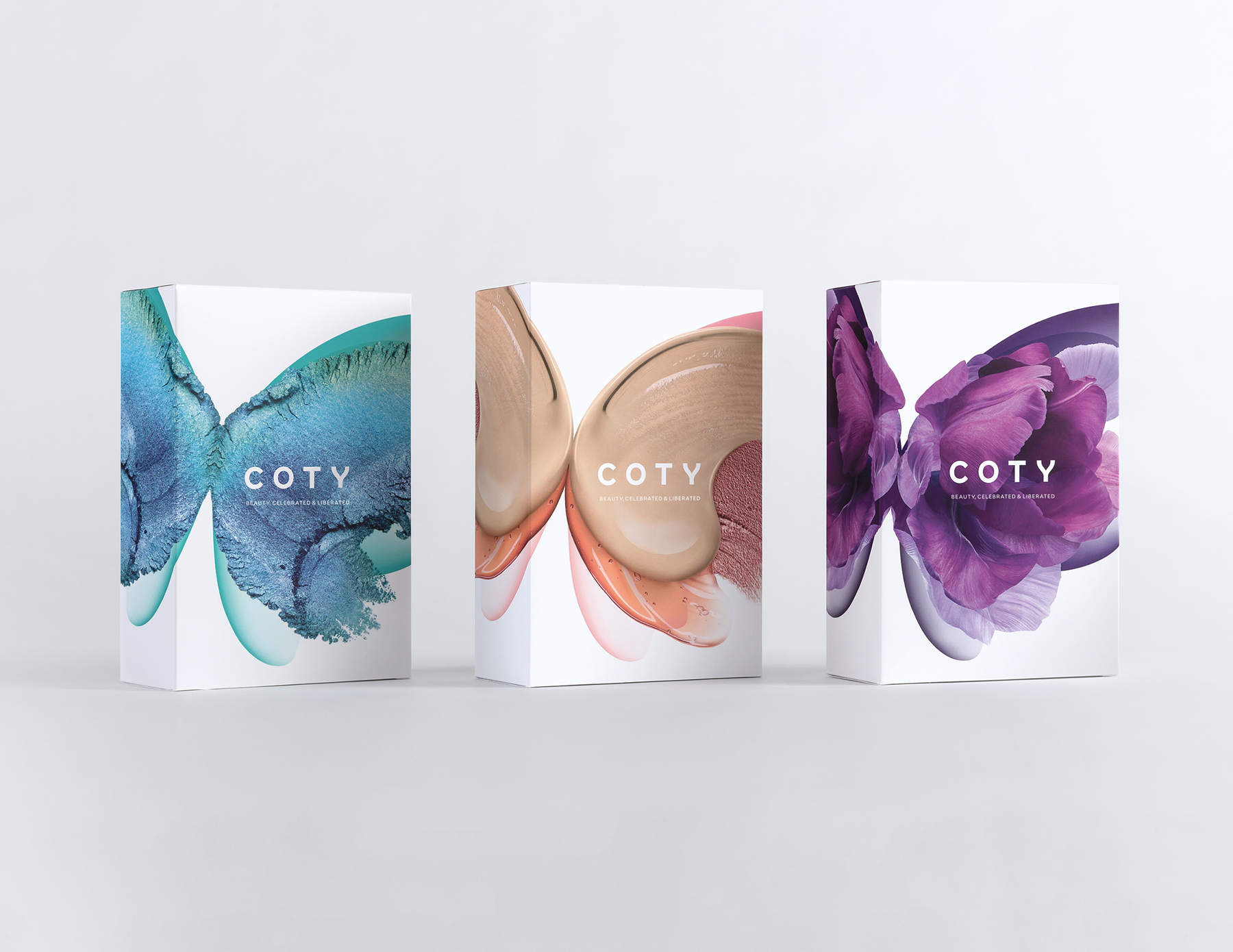
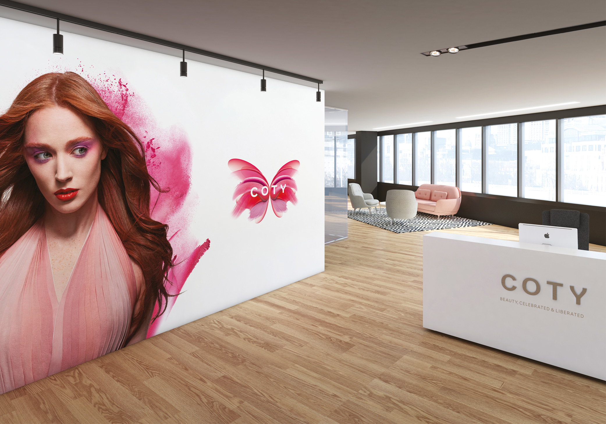
We placed significant emphasis on defining Coty’s purpose – “to celebrate and liberate the diversity of beauty” – as an aspirational rallying call for cultural alignment and driver for behaviour change, as well as market differentiation. It was also the perfect platform for a dynamic and fresh visual identity. A unique series of butterflies symbolise the diversity of beauty in nature and reflect the many different kinds of beauty in people around the world. The butterflies also showcase Coty’s core specialisms – fragrance, hair and cosmetics – with each one crafted from the raw materials used in Coty’s iconic brands like OPI, Rimmel, Wella, Covergirl and Philosophy.
A brand new language
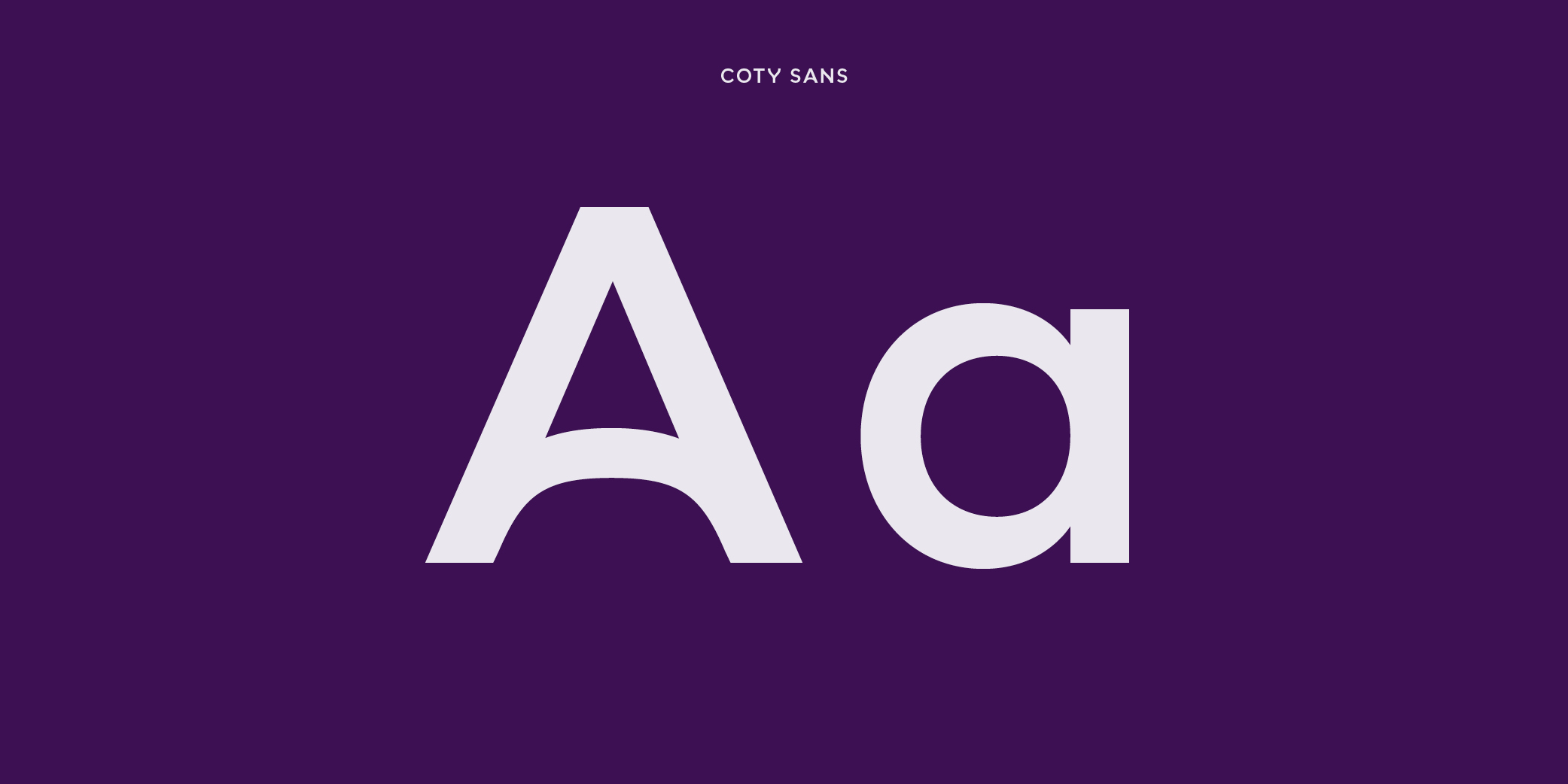
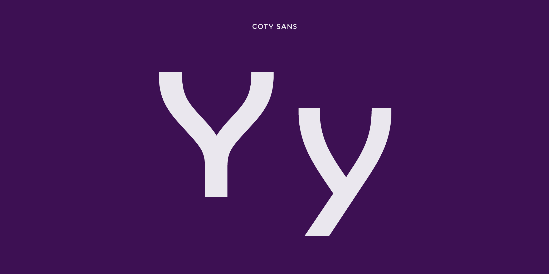
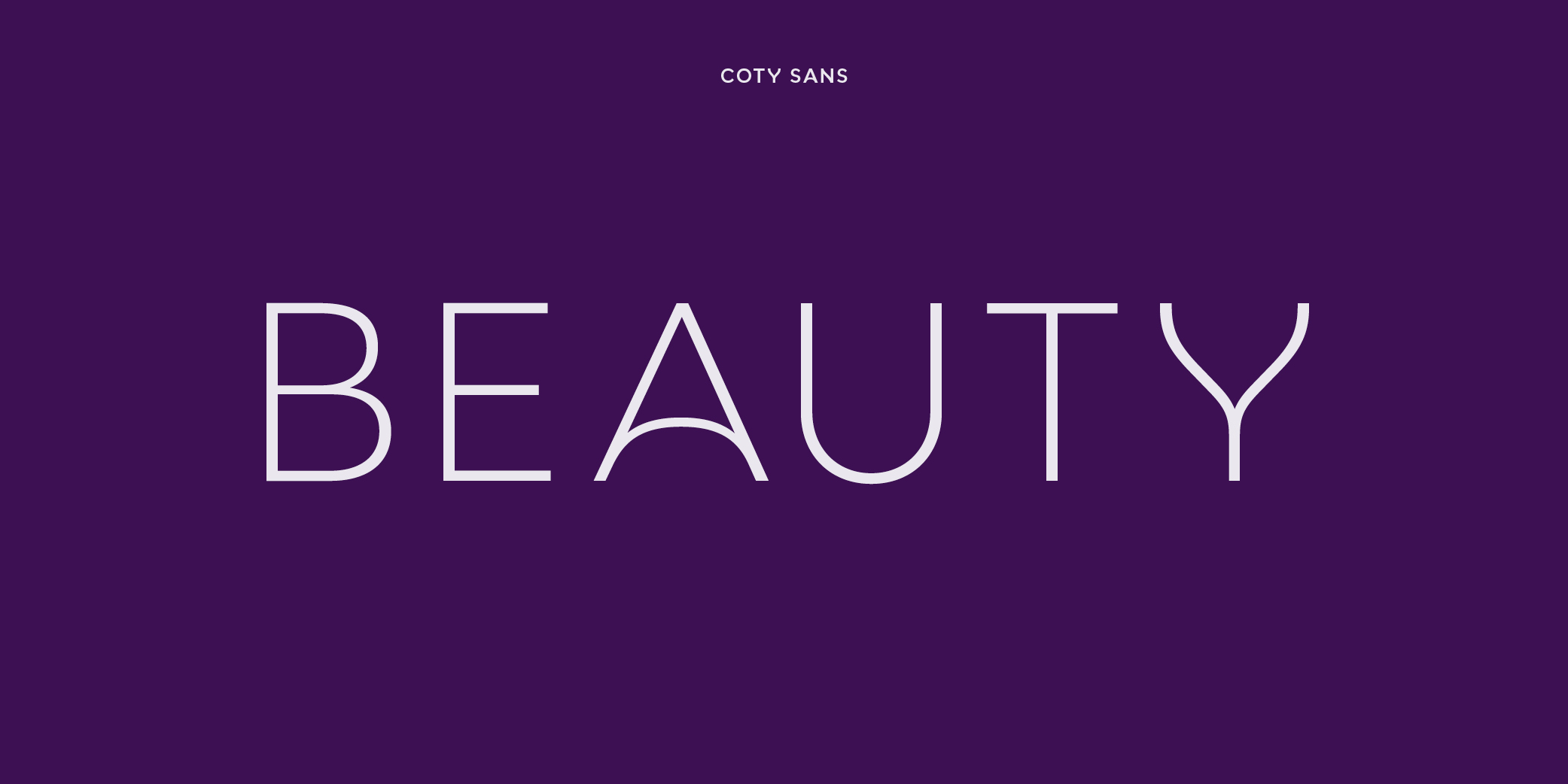
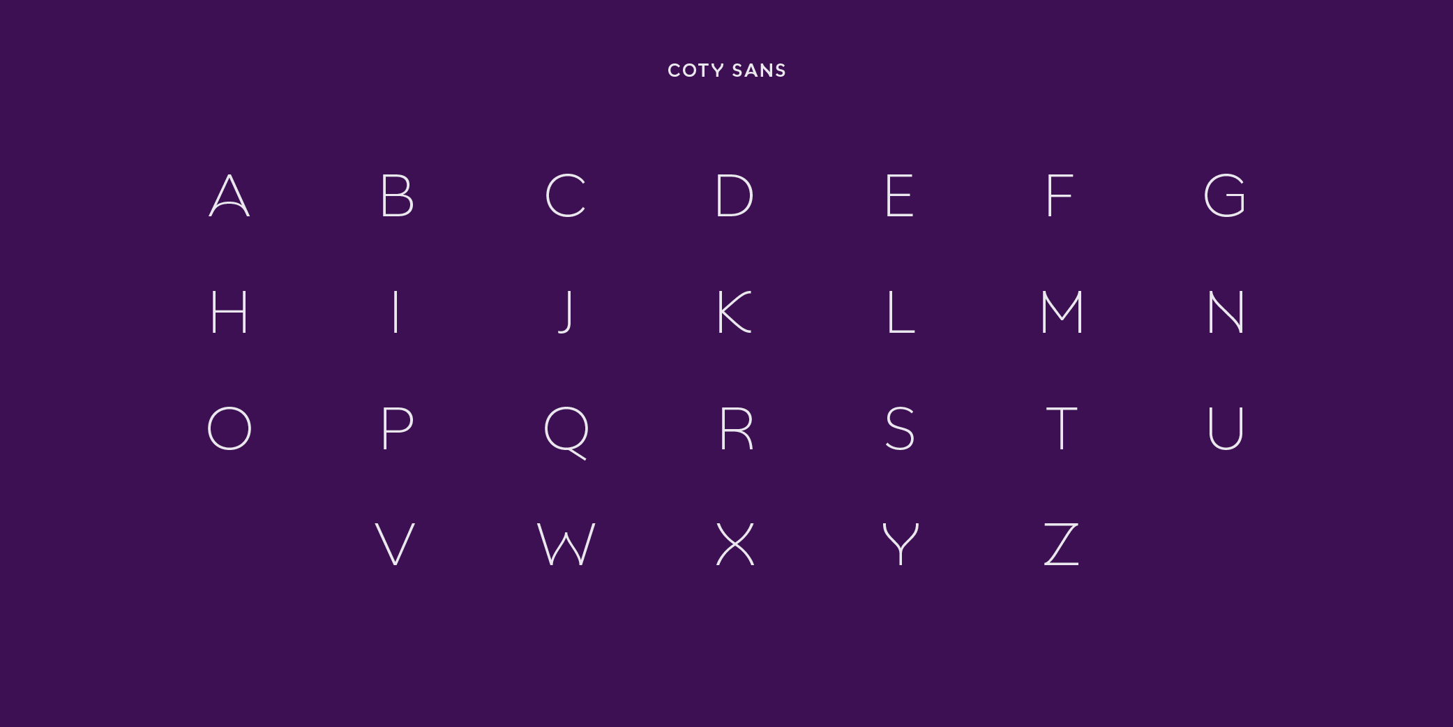
To build a brand design system with longevity, flexibility and distinctiveness, we developed the elegant and unique font Coty Sans, imbued with special curves mirroring a butterfly’s symmetry.
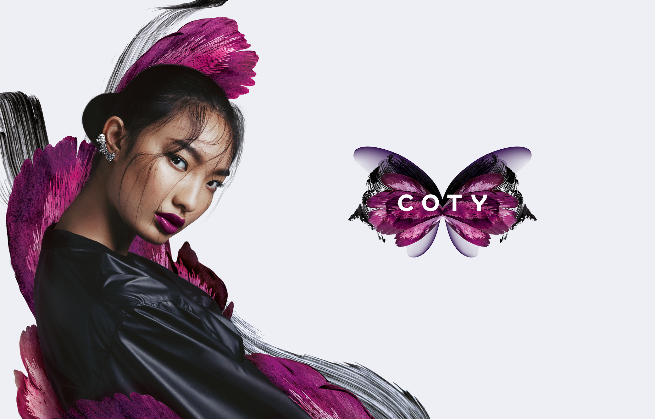
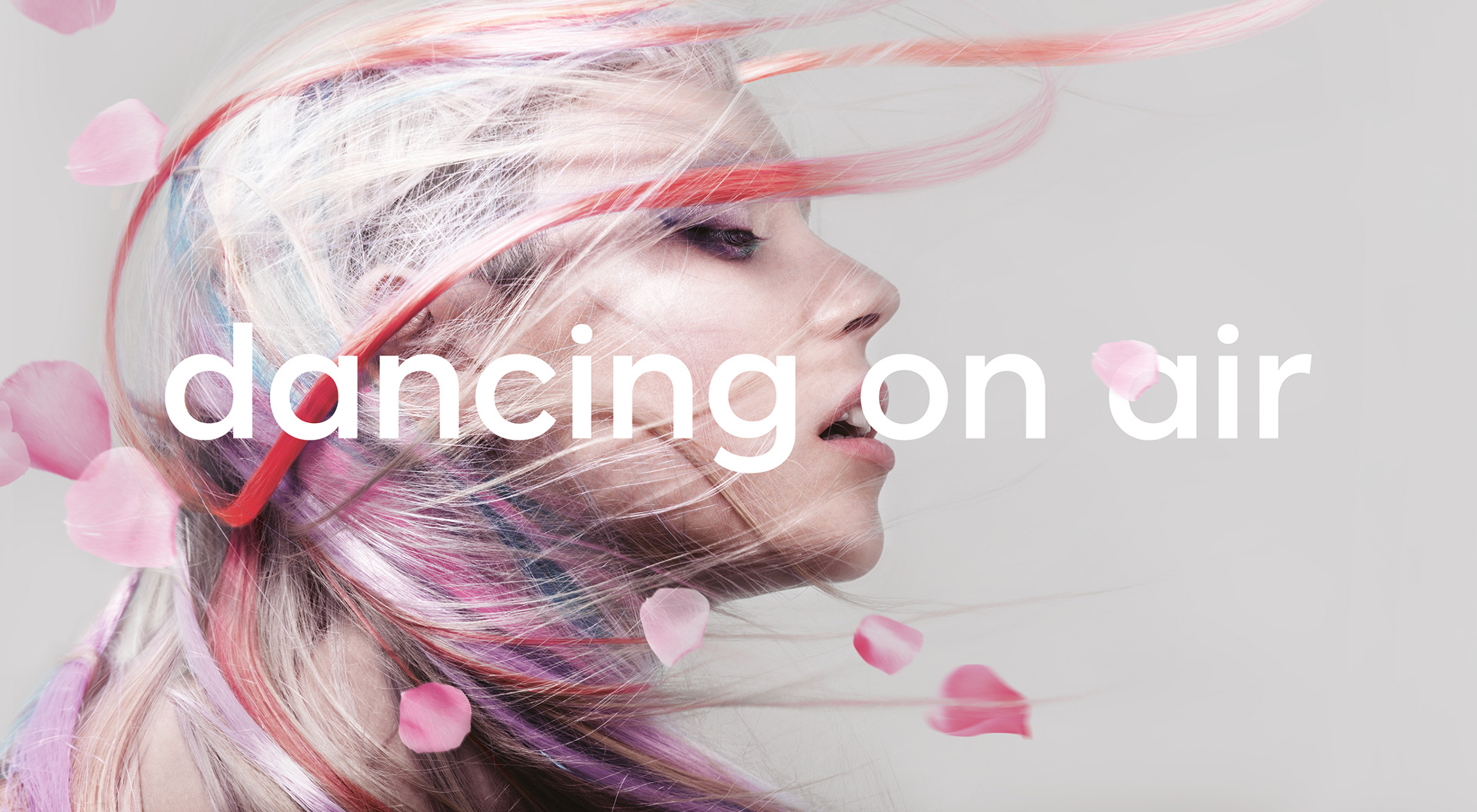
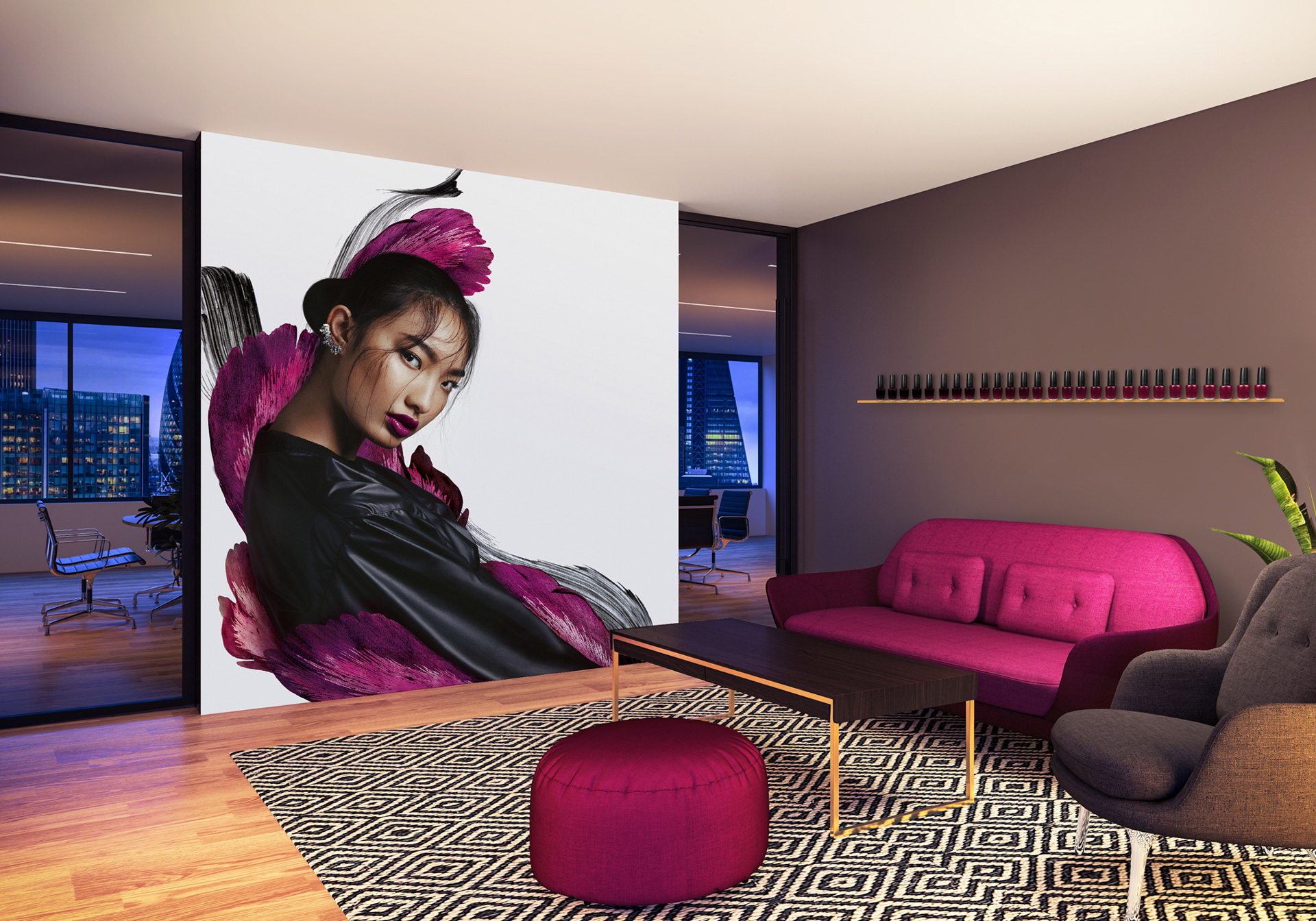
A secondary visual language uses textures and materials from the wings to build an ownable brand asset system. Each butterfly is then paired with a uniquely ‘beautiful’ person, to further celebrate and liberate diversity.
A global launch
Coty’s new brand launched simultaneously across 130+ countries. To celebrate the merger, we created the first ever joint fragrance gift, containing Coty’s CK and P&G’s Hugo Boss. Communications and branded interiors helped embed Coty’s new and unique entrepreneurial culture and distinctive values internally.
Client
Coty
Project
Rebranding global No3 in beauty
Sectors
B2B
Fashion & Retail
Disciplines
Animation
Awareness
Brand Strategy
Branding
Communications
Corporate reporting
Digital
Events
Experiential
Film
Internal Comms
Marketing
Positioning
Print
Strategy
Visual Identity
