A new face on the block?
Kao is No 1 among Japanese public companies, with over 33,000 employees and products sold in around 100 countries in the world.
Have you heard of them? No, nor had we. But you’ll definitely know some of their famous beauty brands; John Frieda, Molton Brown, KMS, Bioré and Goldwell. We were appointed in 2018 to help bring life to the Kao EMEA employer brand, with the aim of raising awareness of and pride in this innovative and fascinating heritage business.
See our Kao EMEA website work here
The Face of Kao
To build an employer brand expression that is progressive, engaging and appealing to westerners and still respectful of its Japanese heritage (est 1887) we formulated a set of creative co-ordinates that would guide all our communications – simple, elegant, warm and inventive.
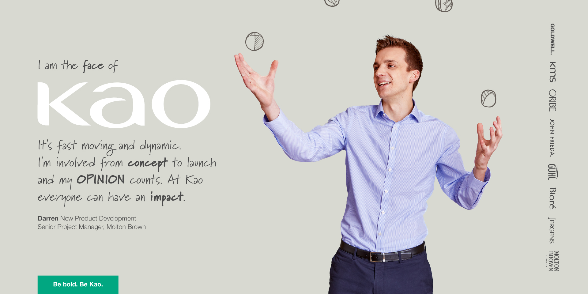
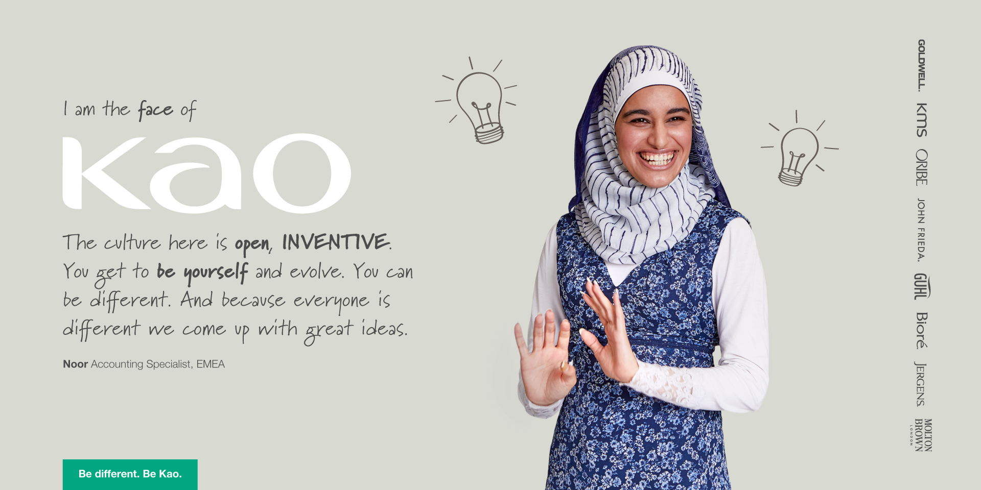
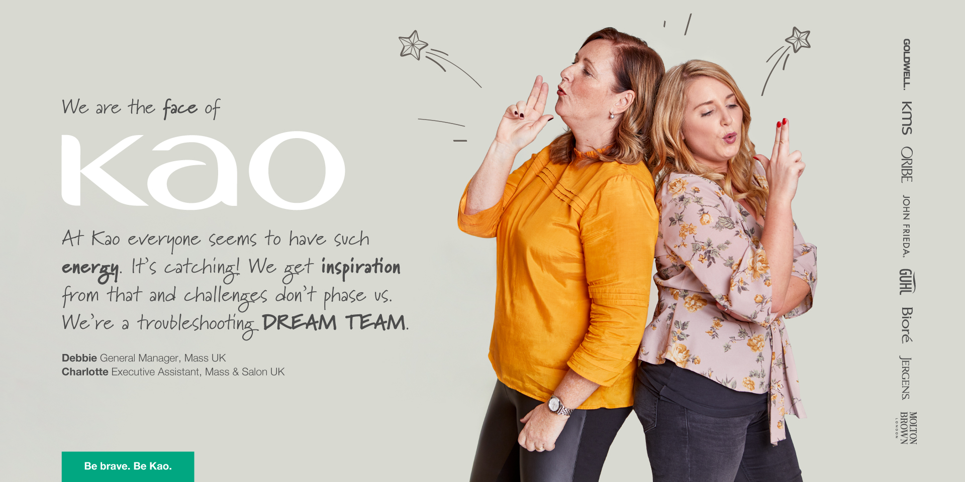
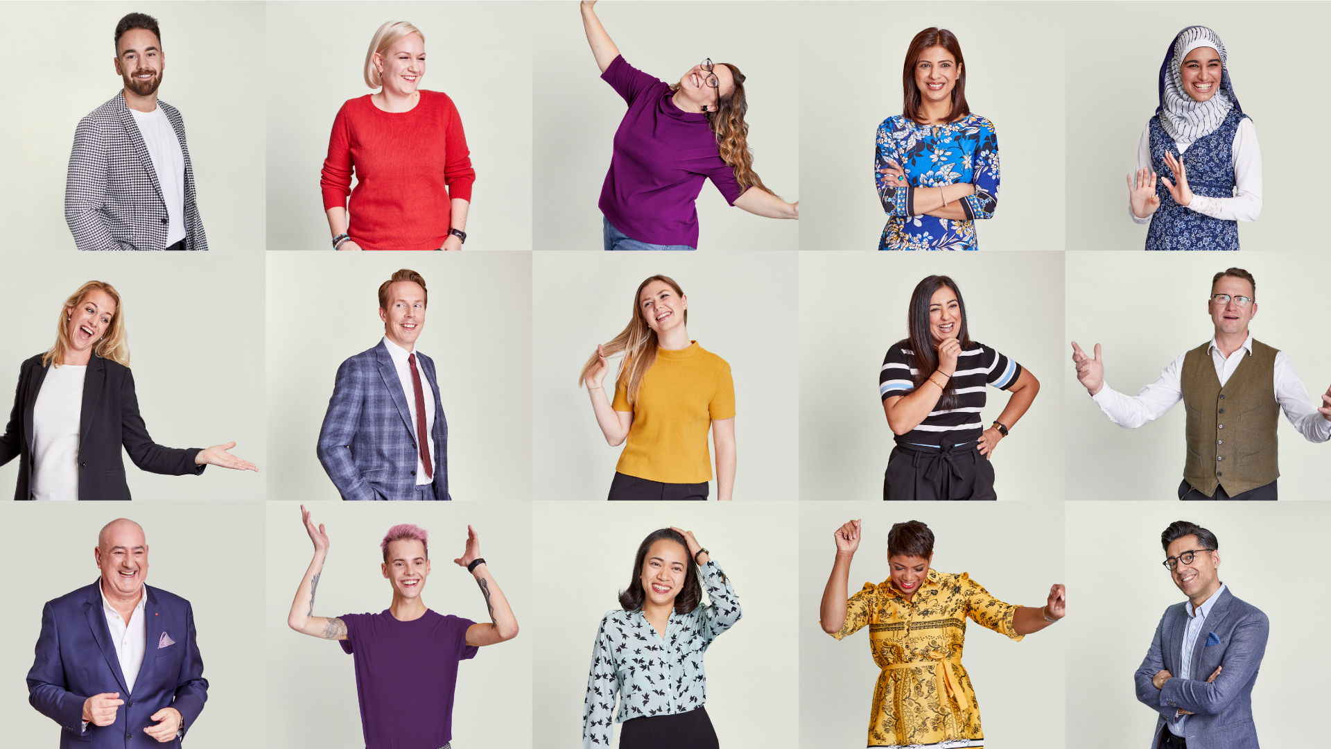
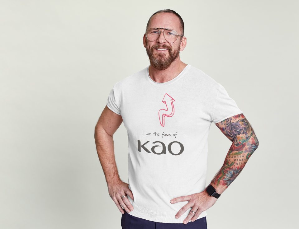
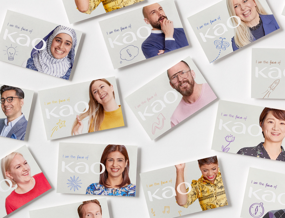
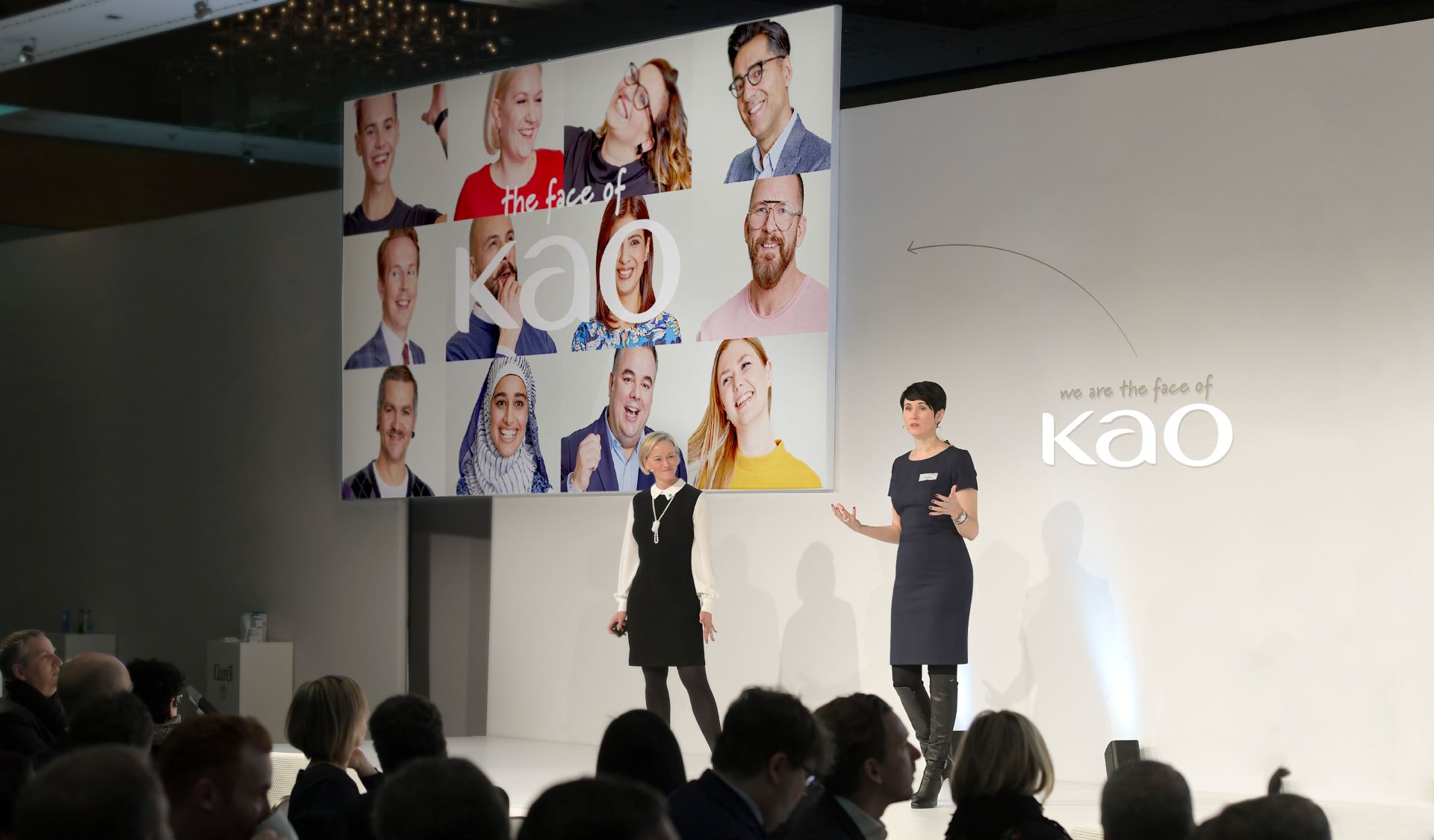
The resulting employer brand proposition The Face of Kao aims to authentically showcase employees across the business expressing their passion and enthusiasm for Kao culture and their meaningful work. And despite its distance from the mothership in Japan, the business clearly espouses the deeply held values of integrity, respect and diligence. Impressively, all 60+ employees at all levels of the business we interviewed, filmed and photographed (over a number of shoots in 3 countries) demonstrated enthusiasm and understanding of Kao’s unique Japanese culture based on; sustainability Kirei, constant innovation Yoki-Monosukuri, and intense consumer focus Genba.


Be yourself. Be Kao.
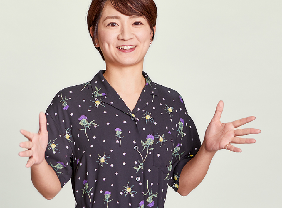
Using a specific method of creative direction to capture the authentic, ‘in the moment’ imagery, we photographed and videoed Kao leaders and employees at all levels (even the self-conscious and shy) bringing new Kao communications to life. Each personal story focuses on what Kao has enabled them to be. An ever changing sign off Be yourself. Be Kao. demonstrates Kao’s ability to allow people to be themselves and enable their development in genuinely inspiring ways – be inventive, be brave, be confident, be respectful – are just a handful of their individual perspectives.
Carefully-crafted aesthetic
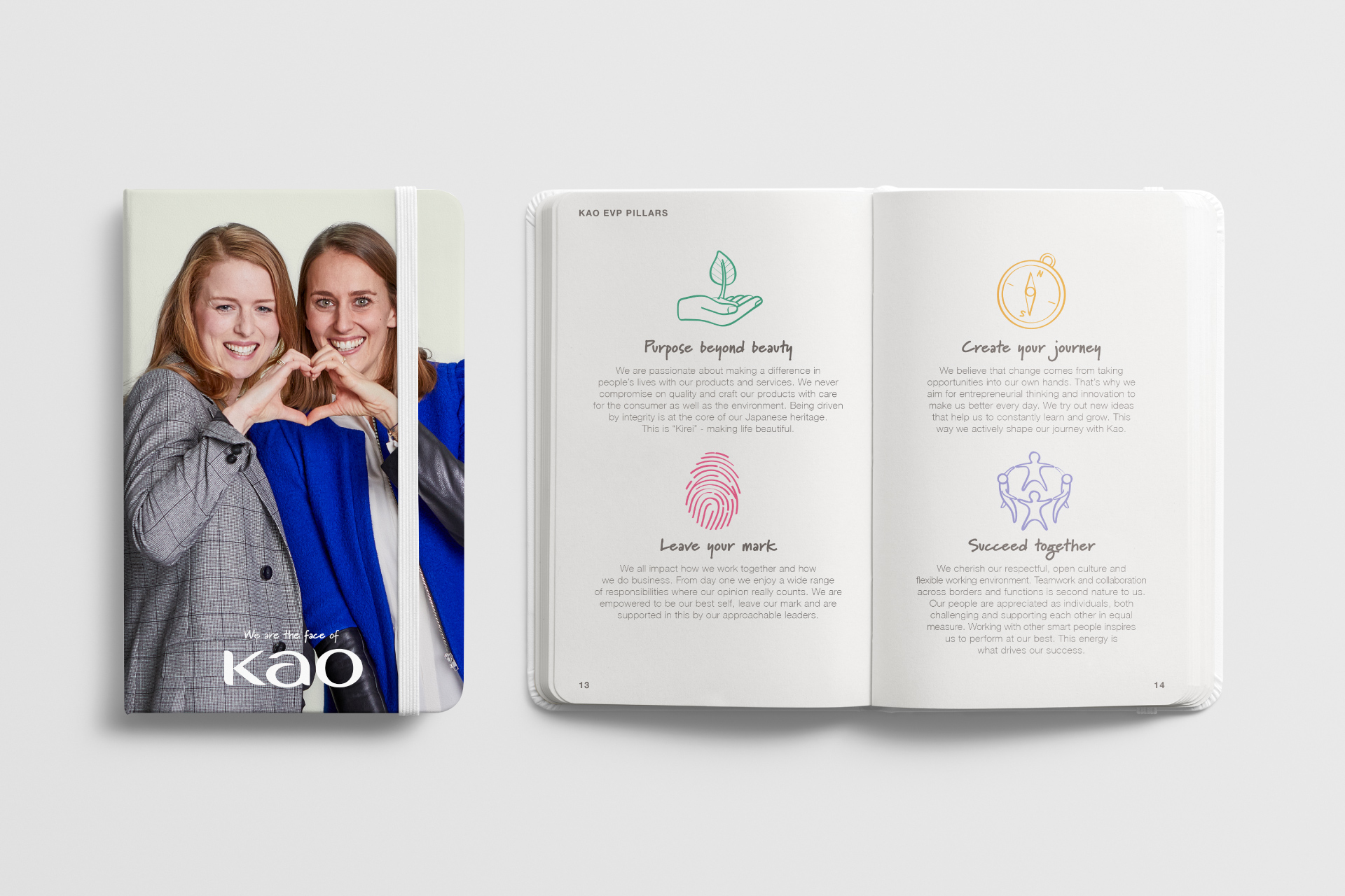
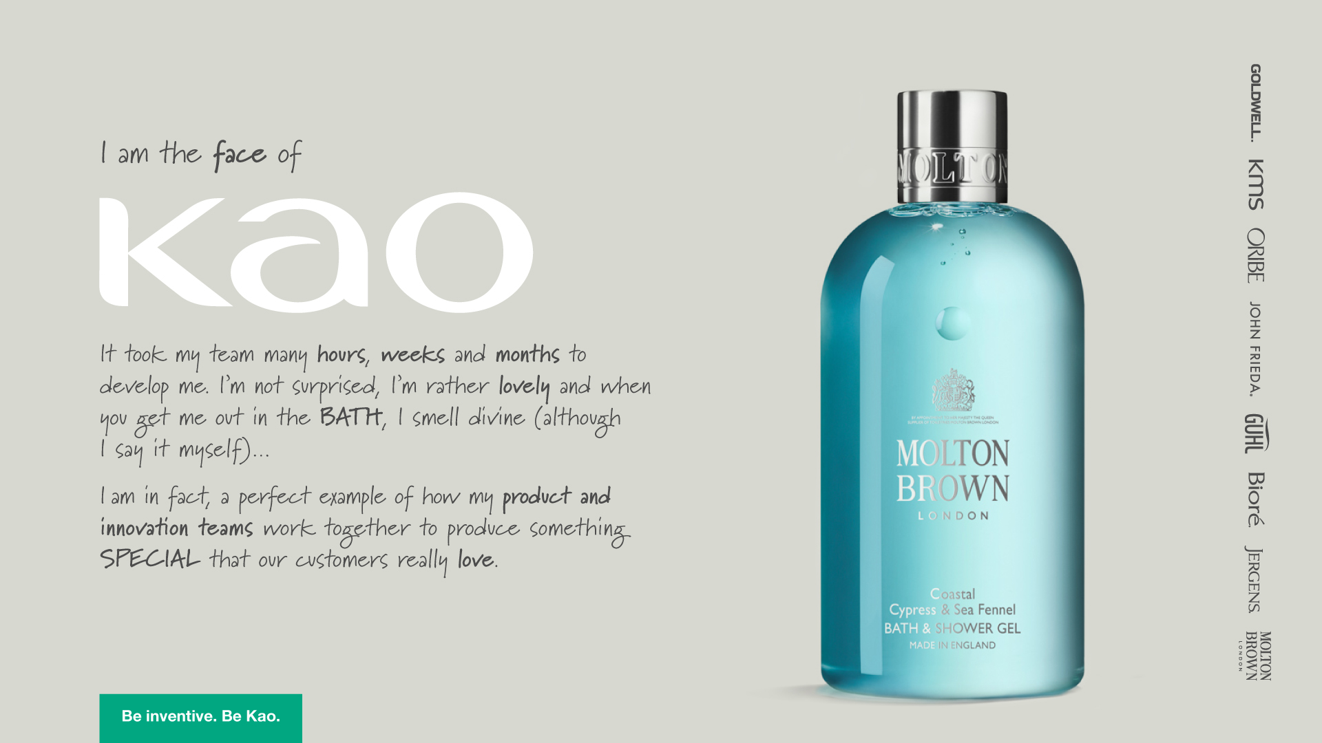
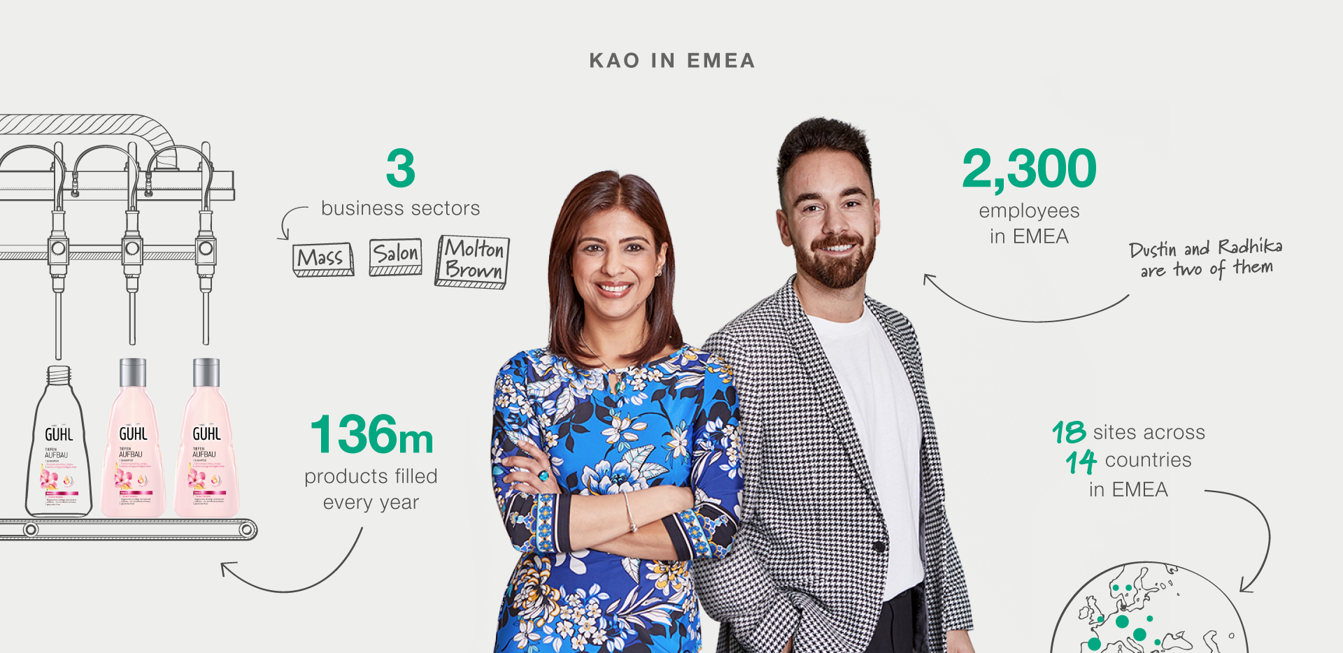
As part of our creative development stage, we studied Japanese design, art and popular culture to ensure we were able to make the visual link between east and west. As a result, key creative attributes have been developed. To enhance the ‘natural moments’ we captured on film, a handwritten typography style builds on the personal touch to tell people stories. Bespoke visual content, infographics and iconography are also hand-drawn, bringing a human quality to the words. Using a soft grey as a subtle backdrop it allows Kao people and brands to shine.
Finally, in a considered connection to Japanese calligraphy, we’ve added an elegant vertical design for key product brand logos.
Client
Kao
Project
Employer branding, engagement and recruitment
Sectors
B2B
Consumer Goods
Fashion & Retail
Disciplines
Awareness
Branding
Communications
Digital
Film
Internal Comms
Photography
Print
Social Media
Visual Identity
